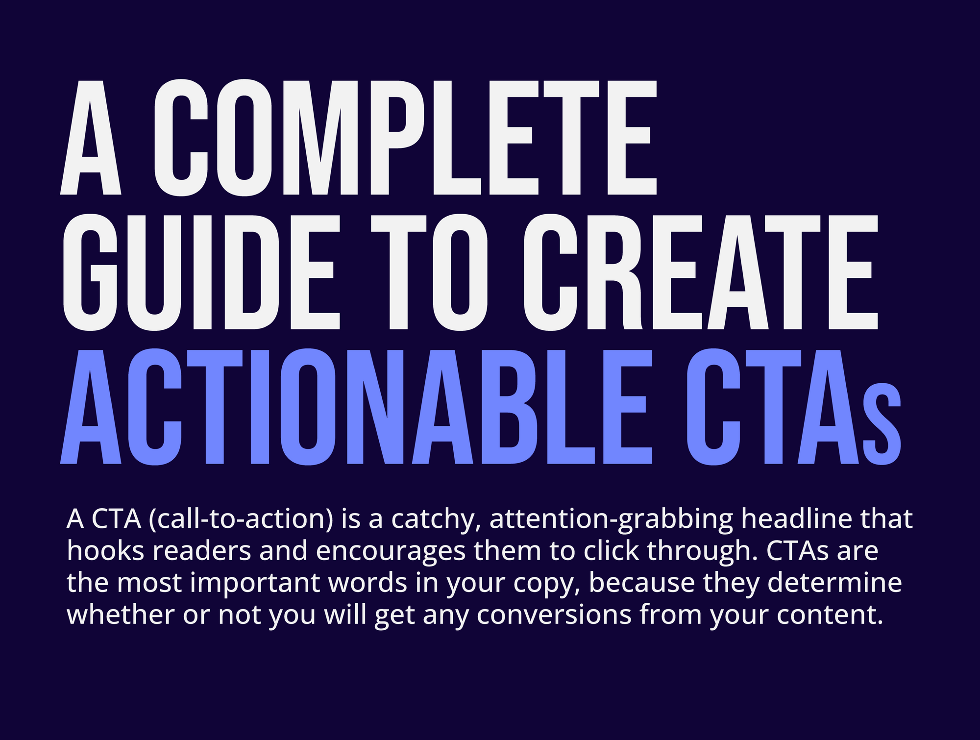
A Complete Guide to Create Actionable CTAs

Introduction
A whopping 90% of email recipients who read the subject line also read your CTA. With a 21.5% email open rate in 2021, crafting a clear and perfect subject line and CTA becomes inevitable to make your email marketing campaign a success.
Email marketing campaigns aim to redirect their prospects to their website or get them to click their CTA. The click-to-open rate of your CTA defines how many of your prospects you manage to bring into your funnel. Hence, it is crucial to ensure your CTA is actionable.
Although there is a lot said about CTAs, its significance can hardly be overstated. A Hubspot study revealed that personalized CTAs perform 202% better than general ones. As the entire marketing realm started prioritizing personalization, discussing the significance and science behind CTA is the need of the hour. This article discusses everything, from the basics to the most advanced metrics to calculate the performance of your CTAs.
What is a CTA?
A CTA is a short, attention-grabbing piece of copy that hooks readers and encourages them to click through. They are also known as call-to-actions or CTAs for short. The best CTA is one that speaks directly to your audience's pain point and helps them solve it. It is an instruction that tells your audience what you want them to do, and why.
CTAs are, arguably, the most important words in your overall copy, because they determine whether or not you will get any conversions from your campaign. If it doesn't have a clear CTA, the purpose of the content is lost.
A CTA can be used in a variety of ways. You might use it to call attention to a particular feature or benefit of a product or service, or you could use it to prompt people to take an action—like signing up for a newsletter, downloading an app, or buying something.
Significance of CTA
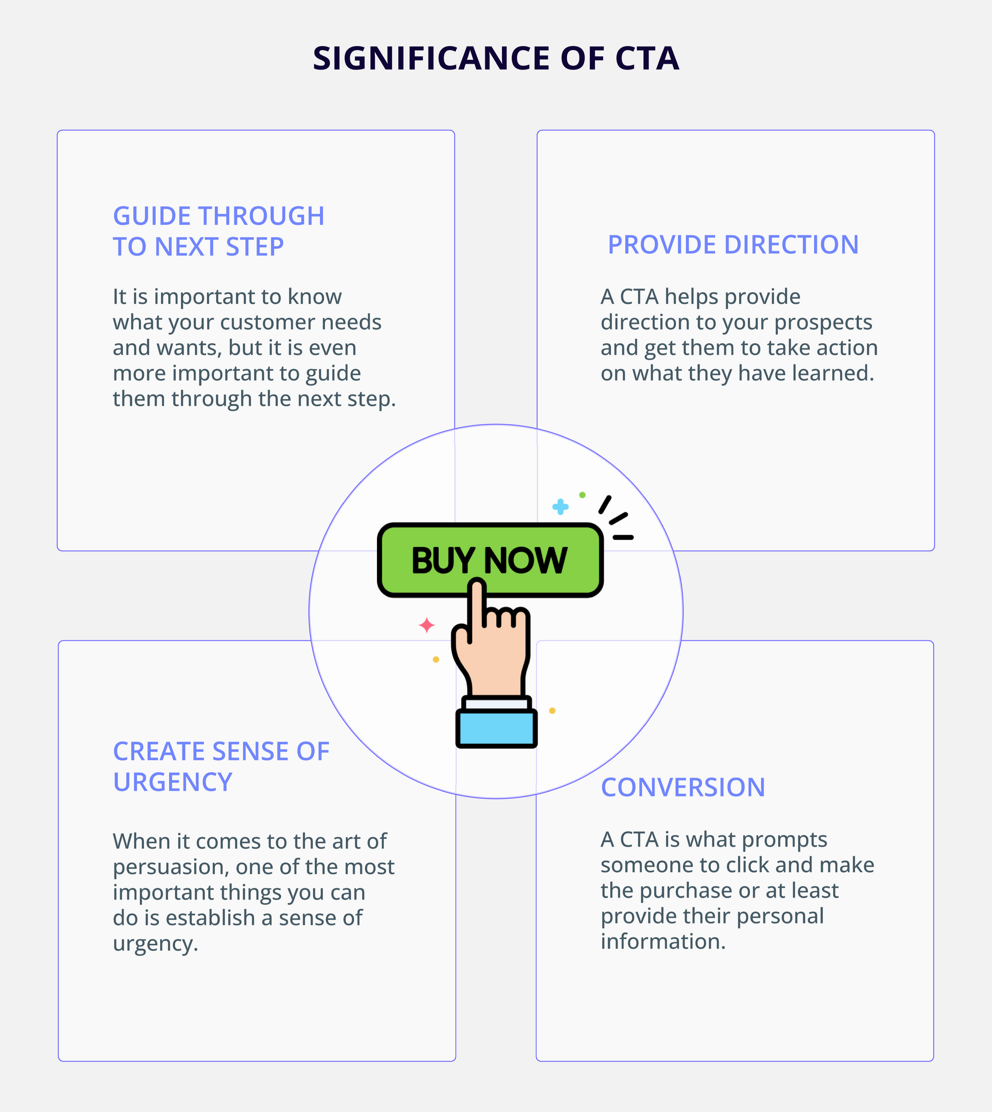
1. Guide to the next step
It is important to know what your customer needs and wants, but it is even more important to guide them through the next step. CTAs are an important part of any marketing campaign because they help guide prospects through the process from start to finish by providing clear instructions on how they can take action on whatever it is that you are offering up.
2. Provide direction
In the age of information overload, we are all drowning in data. We are inundated with thousands of options every single day, and it can feel like we are trying to swim upstream in a river of information. But sometimes you just need to see something that makes you jump out of your seat and say "Yes!"
That is where CTAs come in. A CTA is the call that helps you provide direction to your prospects and get them to take action on what they have learned.
3. Create sense of urgency
When it comes to the art of persuasion, one of the most important things you can do is establish a sense of urgency. If you can demonstrate that your product or service has value now or if you can show that it could be of great value in the future, that will help to nudge your customers into taking action and buying from you - if not now then in future.
4. Conversion
The CTA (call-to-action) may be the single most important element of a conversion-focused marketing campaign. A CTA is what prompts someone to click and make the purchase or at least provide the details. If you have a great CTA, you can increase your sales by manifold. That's huge.
The science and psychology behind CTA
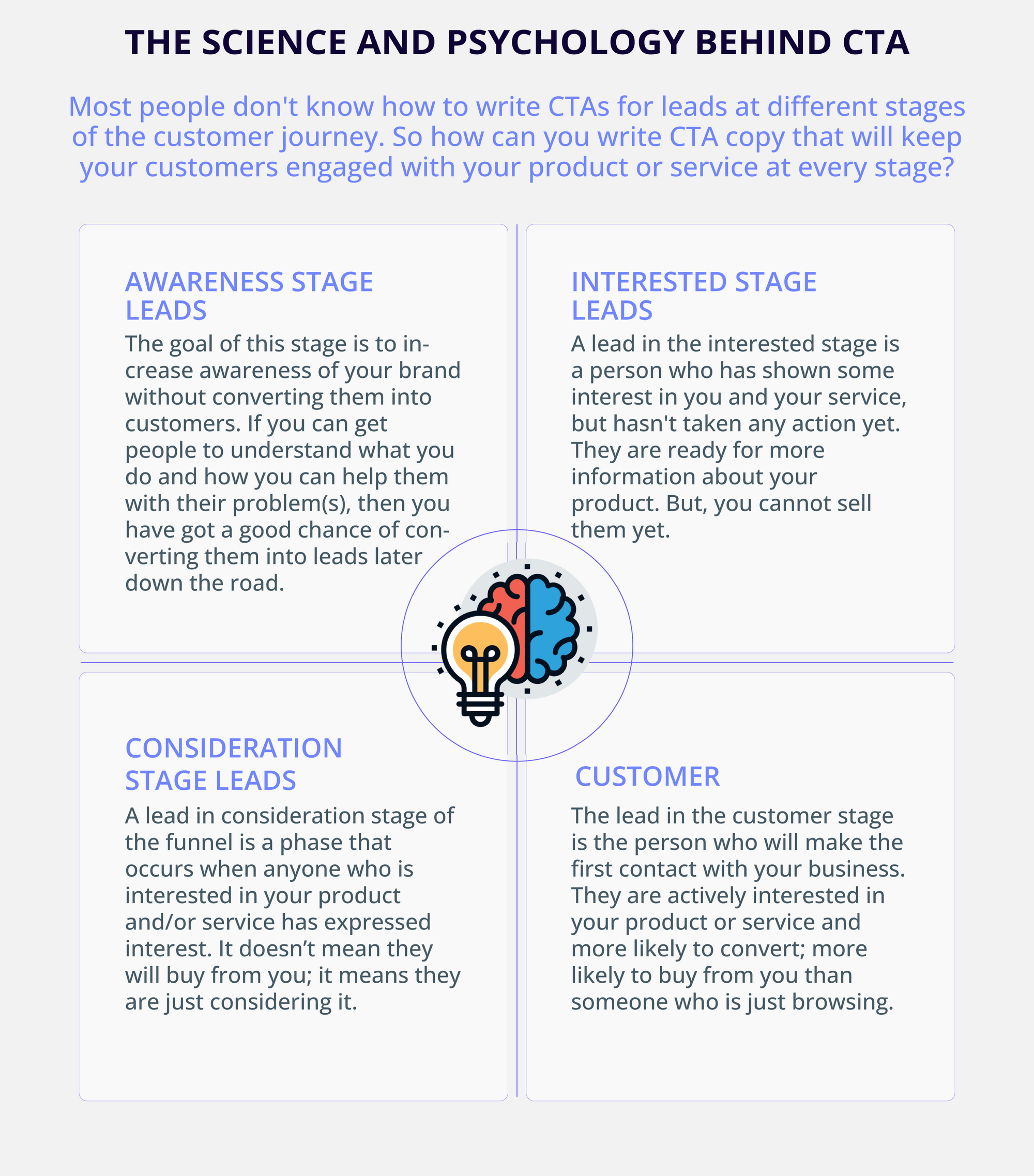
It is no secret that CTAs in copywriting is important. But what if we tell you its significance varies at different stages of the funnel? The problem is, a lot of businesses don't know how to write CTAs for leads at different stages of their journey. And this lack of knowledge causes them to lose leads and miss out on potential revenue. So how can you write CTA copy that will keep your customers engaged with your product or service at every stage? You need to be aware of the intention and position of your lead at different stages of your funnel first.
1. Leads at the Awareness Stage
The lead in the awareness stage of the funnel is the point where your customer has made the decision to know more about your product as a service. The goal of this stage is to increase awareness of your brand without converting them into customers. If you can get people to understand what you do and how you can help them with their problem(s), then you have a good chance of converting them into leads later down the road when it is easier for them to make that initial decision about whether or not they want something from you. So, in this stage, you should focus on providing them with more value and write CTAs on similar lines.
● Subscribe to our newsletter to receive more interesting and valuable tips
● Get insights delivered to your inbox
● Get your free e-book today.
2. Leads at the Interested Stage
A lead in the interested stage is a person who has shown some interest in you and your service, but hasn't taken any action yet. You want them to become a lead in the pipeline, because that means they are ready for more information about your company or product. But, remember, you cannot sell to them already.
● Download this case study and see how our customers with similar challenges are growing in their business.
● Register to this webinar to see how we help our customers deal with xxx painpoint.
● Download this free e-book and master (product benefit).
3. Leads at the Consideration Stage
A lead in consideration stage of the funnel is a phase that occurs when anyone who is interested in your product and/or service has expressed interest. It is important to note that this phase is different from a conversion. The lead in consideration stage doesn't necessarily mean that they will buy from you; it means they are just considering buying from you.
That said, the information you gather during the lead in consideration phase of your funnel can help you make better decisions about how to market your product or service and write better and personalized CTA copies.
● Get started for free with (product name)
● Book a demo to see (company name) in action
● Fill the webform and we will get in touch with you ASAP.
4. Customer Stage
The lead in the customer stage is actively interested in your product or service and more likely to convert; more likely to buy from you than someone who is just browsing. It is also defined as a stage where the prospect has already converted into a customer.
The lead in the customer stage is different from a “potential” customer—the one who is considering buying your product but hasn't made up their mind yet. The potential customer is still on their way to becoming a lead: they are thinking about it, researching it, and maybe even looking at alternatives. But they haven't taken any real steps toward actually making the purchase.
Most marketing funnels end at the customer stage. Once a prospect is converted, very few businesses nurture the customer post-purchase, which is not an ideal thing to do in marketing. Post-purchase nurturing is equally significant to ensure retention, word of mouth marketing, and boost brand loyalty.
Hence, you should devise a separate CTA strategy for customers. Unlike for prospects, the goals may slightly vary but the purpose remains to be the same; that is to keep the customer in loop. For example, you need a different CTA to redirect your customer to a new product launch or prompt them to download a new software update for enhanced experience.
● Check how our new feature update helps you deal with (pain point of the customer)
● Read this case study to see how customers like you are using our (product name) differently and learn how to tackle your business challenges in a different way.
● We value our customers. That is why, we have curated a list of tips to help you deal with your (pain point)
Tips to write clickable and convertible CTA
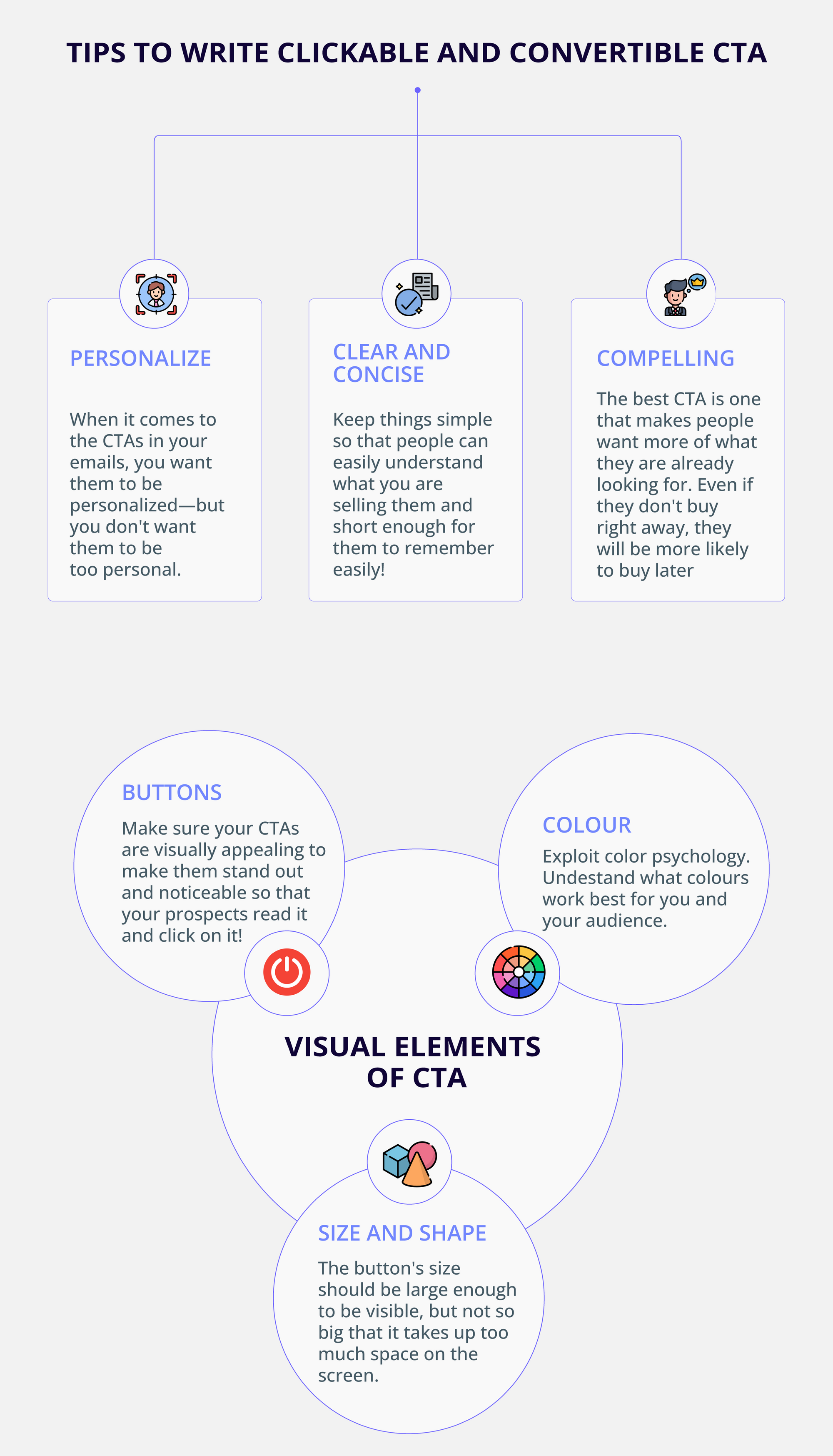
1. Personalize
When it comes to the CTAs in your emails, you want them to be personalized—but you don't want them to be too personal. In fact, you want your CTA to be just right: not too obvious, but also not too vague or promotional. You need a CTA that is going to grab the attention of your recipient, but at the same time make it clear that there is something valuable waiting for them after that click. And if you are going to achieve this balance, one thing is for sure: you can't simply write a generic CTA and expect it to perform as well as one that has been personalized.
2. Clear and concise
It is no secret that most of your customers will go through the trouble of finding your product or service. But they will only do it if they have a clear and concise idea of what you are selling. That is why it is so important to make sure that every one of your CTAs is as clear and concise as possible.
● Clear: Don't make them too long or complicated.
● Concise: This should be obvious by now, but you need to keep things simple so that people can easily understand what you are selling them.
● Succinct: Make sure your CTAs are short enough for people to remember them easily!
3. Compelling
When it comes to landing new customers, you have to be as compelling as possible. Conversions are driven by emotion, and when you are selling something that provides an emotional benefit, the best way to drive that is by making sure your call-to-action (CTA) is as compelling as possible for your audience.
The best CTA is one that makes people want more of what they are already looking for. This way, even if they don't buy right away, they will think about it more often and be more likely to make a purchase at some point in the future!
Visual elements of CTA
1. Buttons
Your CTA buttons are a key part of your sales funnel, but they are not the only part. Always make sure your CTAs are visually appealing to make them stand out and noticeable so that your prospects read it and click on it! You want them to know this is something you want them to do—so make sure the button looks like something that would appeal to them.
2. Colour
If you want to drive more traffic to your website, you need to know how to exploit colour psychology. You might think that this is just a fancy way of saying "make sure your CTA button looks good on the page," but it is not. Instead, it is about understanding what colours work best for you and your audience.
For example, It is easy to think of the colour red as being hot, passionate, and exciting—and that is exactly what you want people to feel when they see your CTA button pop up in their browser. But why?
Red is a color that evokes passion and excitement. It is associated with danger and adrenaline, which makes it a perfect choice for someone who wants to get their attention as quickly as possible. This can be especially effective when combined with other colours like yellow or green, which also make people feel excited or nervous about something (but in a good way!).
3. Size and shape
There is a lot of debate about the size and shape of the CTA button. Some say it should be bigger, bolder, and more prominent than other buttons on your page, while others say that it should be smaller and less obtrusive. There are also those who believe that you should not have a CTA button at all—they feel that it is an outdated method of getting people to take action, and you should use other means instead.
A well-designed CTA button should be easy to read and understand, but also motivate users to take action. The size and shape of the CTA button plays a crucial role in improving customer engagement and conversion rates.
The button's size should be large enough to be visible, but not so big that it takes up too much space on the screen. The shape of the button should match the rest of your design so that it doesn't look weird or confusing.
CTA metrics
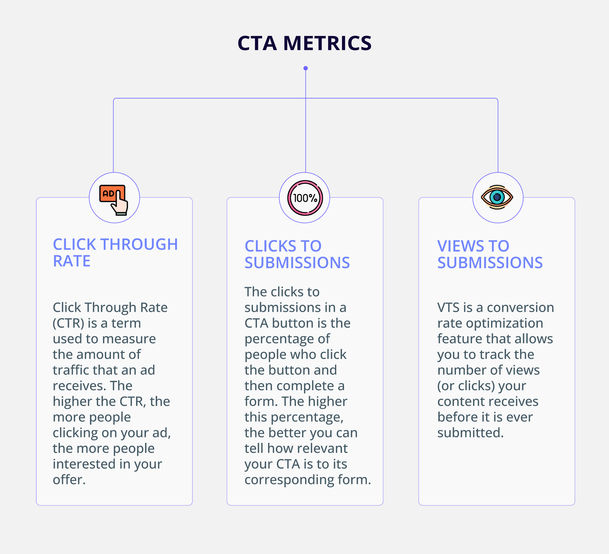
1. Click Through Rate:
Click Through Rate (CTR) is a term used to measure the amount of traffic that an ad receives. It indicates how many people click on an ad and then make a purchase. The higher the CTR, the more people clicking on your ad means there are more customers who are interested in what you have to offer.
2. Clicks to submissions:
The clicks to submissions in a CTA button is the percentage of people who click the button and then complete a form. The higher this percentage, the better you can tell how relevant your CTA is to its corresponding form.
If your CTA has a high clicks to submissions, it means that people are more likely to be interested in completing your form. This could mean that they are more likely to be interested in what you have to offer, or it could mean that they are already interested in what you have to offer and simply need some encouragement.
3. Views to submissions
Views to Submissions (VTS) is a conversion rate optimization feature that allows you to track the number of views (or clicks) your content receives before it is ever submitted.
This is helpful for programmatic advertising, where you can determine how many people are viewing your email or content and what they are clicking on. VTS helps you understand how much value each piece of content adds to your overall marketing strategy.
Measuring these metrics is extremely important to ensure data-backed decisions in your marketing efforts. Tools like Google Analytics, Hotjar, and Mixpanel are some great sources that help you gain a rich insight into your marketing campaigns to optimize your future campaigns for enhanced engagement.
Copywriting guide for CTA
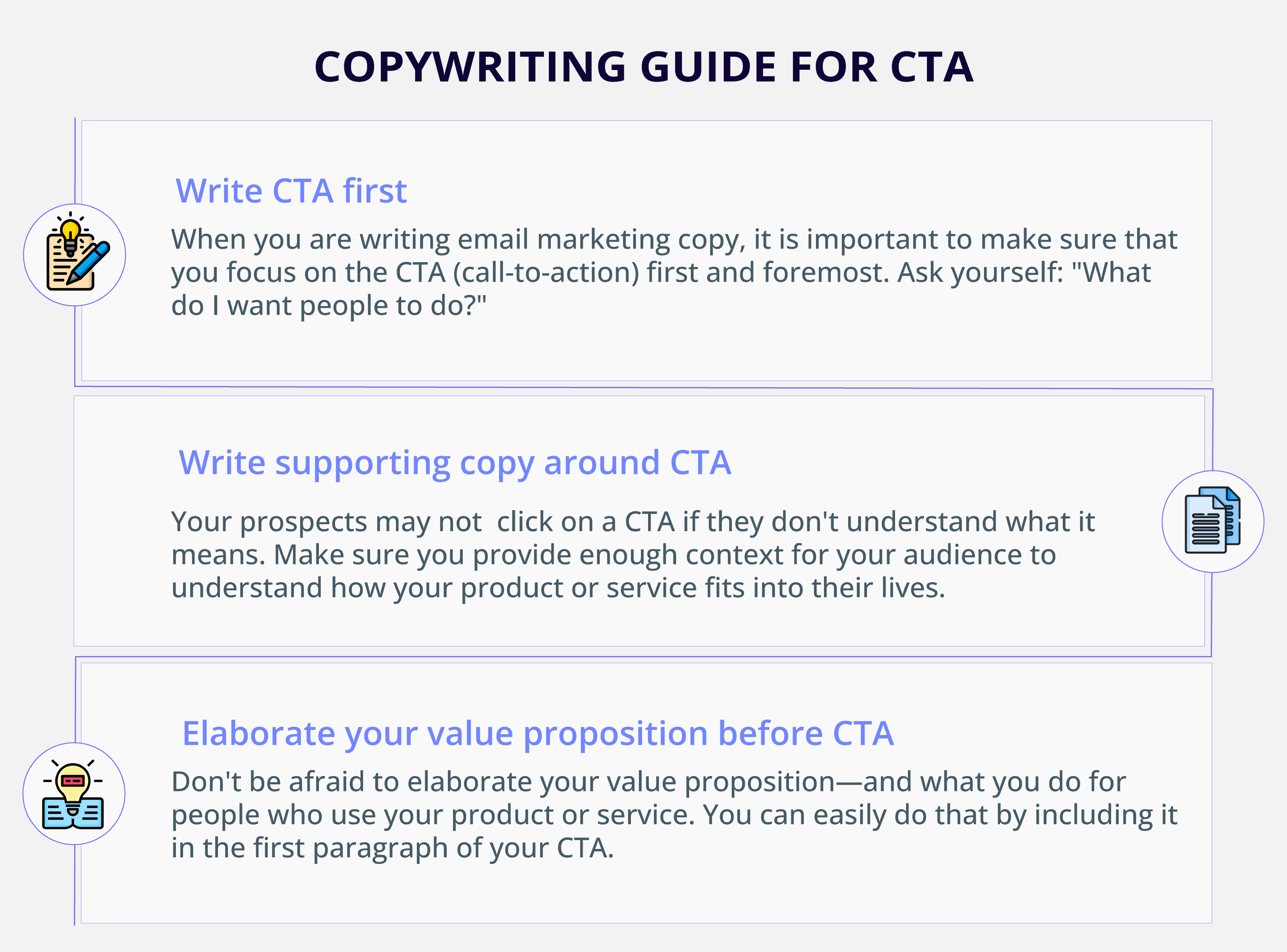
1. Write CTA first
When you are writing email marketing copy, it is important to make sure that you focus on the CTA (call-to-action) first and foremost. In email marketing, your CTA should be the first thing people see when they open your email. This is where they will decide whether or not they want to click through and see what else you have to offer.
The best way to figure out what your CTA should be is by asking yourself: "What do I want people to do?" A good example of this is if someone opens an email at work and is interested in buying something from you, their first action should be clicking on the link that takes them directly to your website! If they don't click on it, then you have lost them for good—which means it is time to rethink what your copy says and how it is presented!
2. Write supporting copy around CTA
A catchy headline, an exciting image, and a call-to-action button—that is all you need to make your email marketing campaign successful.
But what if you are missing one crucial component? What if you are not including a call-to-action (CTA) button? Don't forget to write supporting copy around your CTA in email marketing. Half of your prospects may not click on a CTA if they don't understand what it means. So if you want to get those precious clicks and conversions, make sure you are providing enough context for your audience to understand how your product or service fits into their lives.
3. Elaborate your value proposition before CTA
Don't be afraid to elaborate your value proposition—and what you do for people who use your product or service. You can easily do that by including it in the first paragraph of your CTA.
You don't have to make it an entire essay—but if you leave out the part where you actually break your value proposition down to them, then they won't know what they are getting into when they click on your link.
Conclusion
If you are not getting the results you want from your email marketing campaigns, it is time to take a step back and make sure your campaigns are in alignment with your business goals.
If the answer is no, then it is time to ask yourself why. Is it because of the content? The subject line? The time of day that you send out emails? The CTA? Or is it something else?

No matter how great your email marketing campaigns, you cannot push your lead downward the funnel without a relevant and compelling CTA. One CTA is all it takes to make or break your marketing efforts. Hence, make sure you get the CTA right to increase your ROI.